
Branding Elements
Colors
Origin
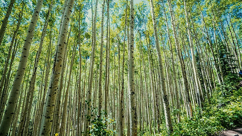
This color palette was pulled from the image on the left. This image was chosen for two reasons: (1) I love aspen trees, and (2) the trees reaching up to the sky represent growth and progress; this is what my brand is all about.
The formulas for each color are included to allow the use of accurately branded colors in any branding collateral.
Meaning

Muted Sky Blue represents the room that we all have to grow. Our capacity is not limited. There is no nebulous "potential" that we will reach someday. We are always growing, and this blue reminds us that there is no limit to what we can accomplish.

Spring Aspens represents the incremental growth that each of us experience. Every time we do something out of our comfort zone, we grow a little bit more. This green reminds us that every experience is an opportunity to grow and continue expanding our capacities.

Chalky Bark represents the progress that we have made in life so far. Just as the trunk of a tree is the evidence of how much it has grown, this cream reminds us of how far we have come and how much we have already learned.